Server graphs
Watching your servers, 24/7.
Our server graphs record lots of performance data from your server, which is then compactly presented in graph format. We have integrated the popular Open Source munin system with our own Mythic Beasts control panel to present attractive graphs tailored to your servers.
- Spotting trends. Got a graph with a positive slope? That could be your disk gradually filling up, or perhaps the system becoming busier. With server graphs, and a whole year's history, you can easily see when you will need to think about buying another disk, or commissioning a new server.
- Monitoring changes. Made an improvement to your code? You've tested it, of course, but now you've uploaded it to the production server. With server graphs, you can easily see if that improved disk performance came at the cost of increased memory usage.
- Problem analysis. Did your server just become unresponsive? Or even crash? If you're lucky, there's some evidence as to what went wrong in the log files. But with server graphs, you've got a slew of extra data you can bring to bear on the problem.
Technical details
For managed hosting customers, we will take care of setting up the munin client on your server. We can also configure any special requests you may have—we may even write a custom plugin for you if necessary! (See sidebar.)
If you are managing your own server, you simply need to install the lightweight munin-node framework - please see our documentation for how to install and configure this.
The framework comes with a large number of plugins which make the actual measurements. Standard plugins include CPU usage, disk use, system load, memory use, database queries, disk activity, apache throughput, S.M.A.R.T. statistics, email queue... the sort of metrics that system administrators look at all the time, except that munin really does look at them all the time. More plugins can be downloaded. You can even write your own custom plugins if you like.
Every 5 minutes, our munin master connects to your server and collects current values for all configured variables. There are various options (all with sensible defaults) for which data are collected together, and how they are plotted. The end result is a dozen or so graphs for each server, each available for the last day, week, month, and year. You can view the graphs for all your servers through our control panel.
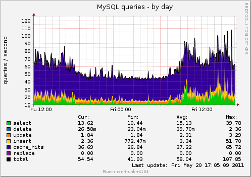
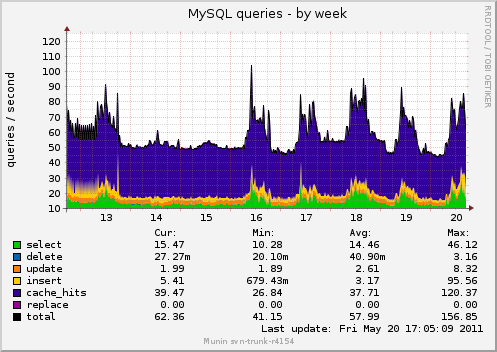
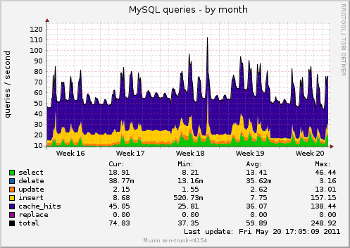
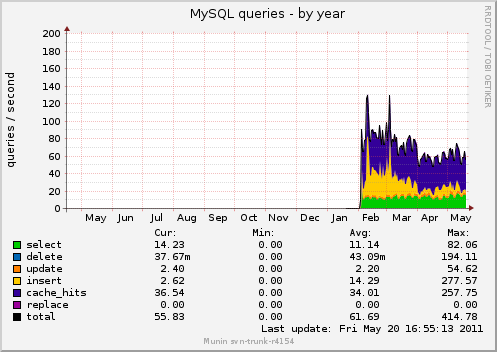
Sample graphs
The samples below are genuine munin graphs for a busy database server, homing in on just the MySQL statistics. The increase in traffic each weekday during office hours is obvious, and you can see that some improvements were made to the codebase in March that reduced the number of database inserts. Otherwise there appears to be a slight trend towards increased traffic, but nothing to worry about yet.
|
|
|
|
Custom plugin case study
One Mythic Beasts managed customer had an issue with a process that was apparently leaking file descriptors. We coded up a new plugin that measured just that; it was only a few lines of perl. After gathering data for a few days, it became clear that the process wasn't leaking descriptors. But sometimes under heavy load it would open up to 700 files at a time. We adjusted the process limits accordingly, and the case was closed. (But munin continues to quietly monitor the process...)